How to display products on a page?
In the Products content area, you can display all your store products or only products from a specific category. To distinguish between categories, you should first assign categories to your products. You can have countless product categories and create a separate Products content area for each category if you wish. You can place them on the same page, create a separate page for each, or combine them in any other way.
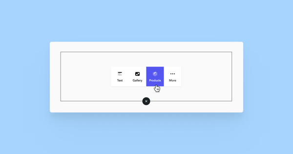
You can add a Products content area like any other type of content area by clicking on the plus sign on the page - in the popup window, select Products.
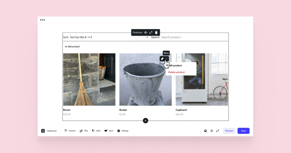
By default, the content area displays all your store products (excluding products in Draft status - they are hidden from public view). In the Products content area, you can add, delete, and modify products.
Creating Multiple Categories
If you have a larger store and want to organise your products into categories, it's best to use separate Products content areas for different product categories and arrange them on one or multiple pages to clearly differentiate product groups.
When using multiple product content areas, you can filter your preferred category or categories in each content area. Here is a guide on how to set categories in the Products content area.
Below are some examples of how you can structure your store:
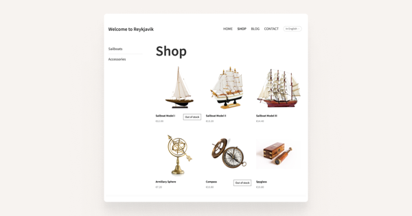
Create subpages for your main store page. You can display all products on the main page and specific category products on subpages. This way, the submenu acts as a product category filter. This solution can be seen in the Reykjavik sample store, where the left column allows you to choose product categories "Sailing Ships" and "Accessories".
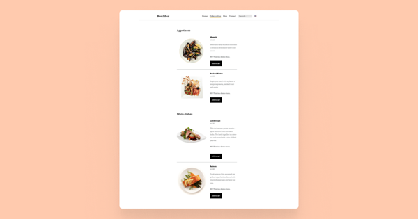
You can visually separate product categories on a single page as well. For example, you can insert Text content areas with subheadings between Products content areas, as done in the Boulder sample store.
-
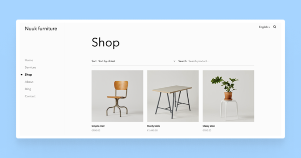
You can also create a combined version of the two, where the main store page displays products in a grid, and subpages list individual category products. This solution is used in the Nuuk sample store.
While the previous examples feature a store as a single menu item, you can actually turn your entire website into a store, with the product selection opening on the home page. This way, you can create a product category selection in the main menu and, if desired, also add a blog and contact page. This is how the Sapporo sample store is built, where the home page displays all products, and the top menu allows navigating to product categories.
Product List Appearance
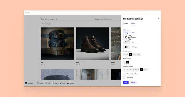
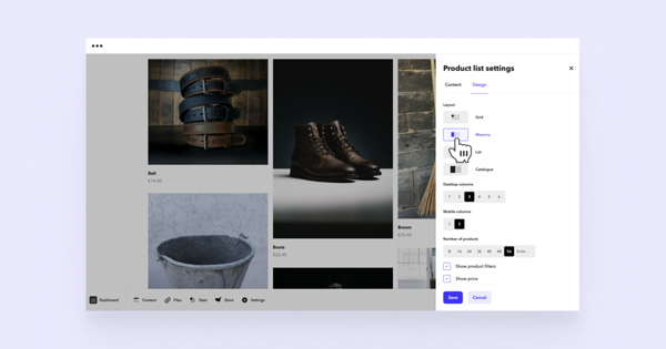
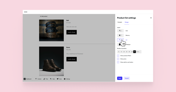
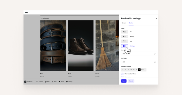
You can change the appearance of the product list by opening the product list settings and going to the Design tab. The Template provides four design options.
Grid
If you have many products and want a classic, orderly layout, you can arrange them in a grid and choose how many columns they appear in on a computer screen and how many columns in mobile view. Both can be set separately.
Masonry
In a mosaic layout, products are also arranged in columns, but the product images retain their original aspect ratio and may vary in height. The number of columns for both computer and mobile screens can be changed separately. Mosaic works well if you want an artistic arrangement for your products, with variously sized images fully visible.
List
If you have fewer products and want a more spaced-out layout, you can arrange them in a list. This displays product descriptions alongside the images, providing more information to the customer without them having to click on the product.
Catalogue
If you want to display your products in large, side-by-side images, you can use the panorama layout. Products are placed in a single row with large, clearly visible images. You can scroll the product row left or right using arrows. Item width and height allow you to adjust the size of the product images in the list view.
