A well-designed landing page will convert traffic into leads. It will
enhance user engagement and collect actionable user data. How is all
that possible? The answer — a strategically placed landing page form
that acts as an immediate call to action (CTA).
The average landing page conversion rate across all industries is 5.89%. However, landing pages that incorporate carefully designed forms
reach up to
11%. This is why every digital marketing strategy should include optimized
landing page forms.
Landing page forms also reduce wasted time and resources. Once you
collect visitors' contact information, you can follow up with those who
are genuinely interested in your product.
We've compiled a list of 20 brilliant landing page form examples for
your inspiration. We've also included actionable tips on using them to
increase engagement on your page.
Let’s get started with the fundamental question.
What does a landing page form look like?
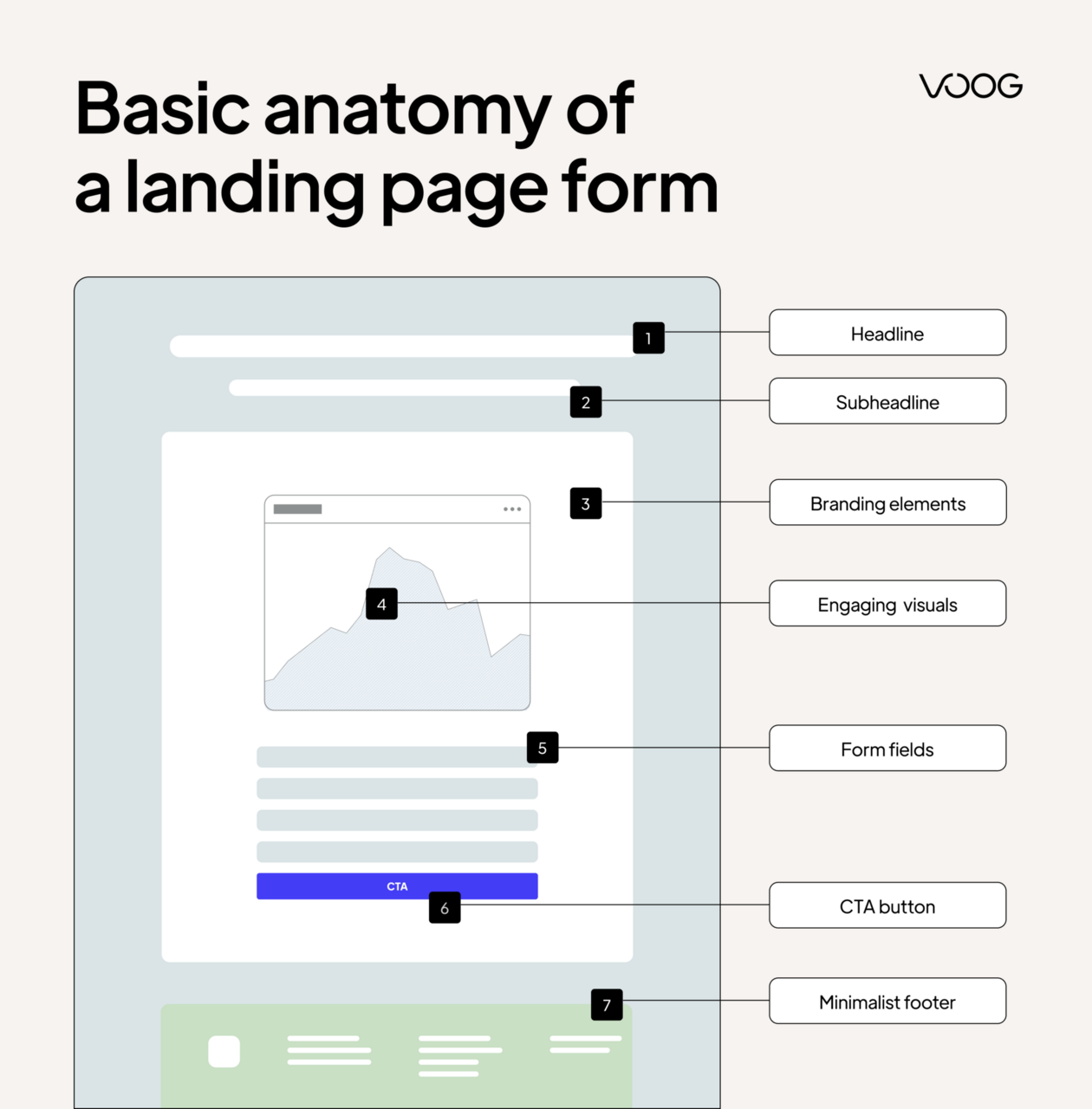
A landing page form is a structured set of input fields. It is designed
to collect specific information from visitors. This can include names,
email addresses, and other relevant details.
Forms are strategically positioned to convert visitors into leads or
customers. This is how the form should be as far as characteristics go.
As simple as possible: The form should limit the number of
fields to only those necessary.
Prominently placed: Visitors should be able to find it easily.
To maximize its effectiveness, a good place is usually above the
fold (visible without scrolling).
The form’s design should be user-friendly and aesthetically pleasing.
This includes:
A thoughtful layout
Intuitive navigation
Responsive elements that work well on both desktop and mobile
devices
Proper spacing, alignment, and field size are also crucial. They prevent
user errors and enhance usability.
Content impacts form effectiveness as well.
📝 The wording in the form should be clear and concise to avoid
confusion. This includes the headline and field labels.
📝 Instructions should be straightforward, and the language should
be inviting, not demanding.
📝 Personalized, conversational text often results in higher
conversion rates.
📝 Images and videos capture interest and guide the visitor’s eye
to the form. Using relevant imagery or short, engaging videos can increase emotional engagement. They complement the textual
content, making the value proposition more compelling.
📝 The CTA’s design, color, and text should stand out on the page.
It should clearly communicate what will happen when clicked.
Phrases like “Get Started,” “Join Free for a Month,” or
“Download Now” imply both the action and the benefit.
Integrating brand elements into the landing page form helps reinforce
brand identity. It can increase trust and recognition.
🎨 It’s best to use brand-specific colors and fonts. This ensures
consistency across all
customer touchpoints.
🎨 The messaging should also match your brand voice. You can choose a professional, friendly, or playful
tone.
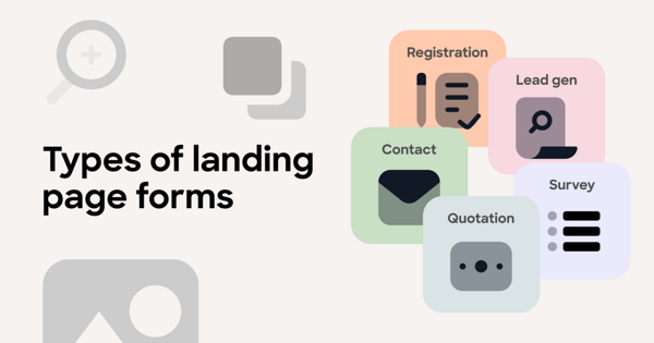
Types of landing page forms
These are the most common types of landing page forms:
Contact forms
These forms ask for basic user information. Such information can include
the name, email address, and maybe a brief message or comment.
🎯 When and why to use: Use a contact form when you want to offer a
simple way for visitors to reach out with questions, concerns, or
interests. They are essential for customer service and the initial
engagement of potential clients. This form type helps maintain communication lines without exposing
direct contact details.
Registration forms
This type of form helps users register for an account or any activity
that requires prior sign-up. They often process more detailed
information. This can include the full name, contact details, and
sometimes payment information.
🎯 When and why to use: When organizing events, webinars, or when
offering membership privileges on your website. They allow you to manage
attendee or participant data, which is crucial for event planning and
access control.
Lead generation forms
These forms capture as much useful information as possible about
potential customers. For example, the name, email, phone number, and
other demographic or firmographic details. They may include more
targeted questions to qualify the lead's interest level or purchasing
power.
🎯 When and why to use: These are used when the primary goal is to
generate qualified leads for a sales team. They are crucial for
nurturing leads through the
sales pipeline, especially in business-to-business (B2B) models or high-ticket
business-to-consumer (B2C) scenarios, where understanding the lead’s
needs can tailor the sales approach.
Survey forms
These forms are used to
gather feedback from users
about products, services, or general experiences. They can range from
simple
satisfaction ratings
to complex questionnaires with multiple-choice and open-ended questions.
🎯 When and why to use: Use survey forms to
collect customer feedback, conduct market research, or gauge public opinion. They can help you
get valuable insights to guide product development, marketing
strategies, and
customer service improvements.
Quotation forms
These forms ask for specific information about what the customer needs.
This can include contact information, details about a project, and
desired services. You can then provide a customized quote based on this
data.
🎯 When and why to use: Use quotation forms for service-based
businesses. For instance, marketing agencies, construction services, or
consultancy firms where pricing is not one-size-fits-all. This form
helps you get the necessary project details to provide accurate pricing.
20 effective landing page form examples
Let's explore the following examples of landing page forms.
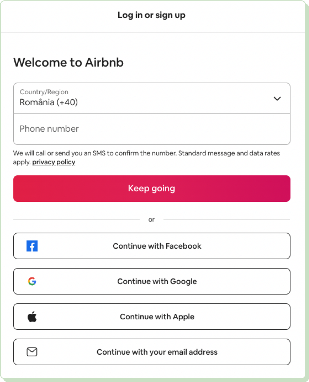
1. Airbnb — Sign up/connect
Why it works
Strong CTA: The "Continue" button is prominently displayed. It
uses action-oriented text that prompts immediate responses. The
alternative CTAs for other sign-up methods are equally
prominent, offering clear next steps.
Social proof: Offering sign-up via well-known social platforms
simplifies the process of using existing accounts. It also
reassures users through familiar interfaces and security
practices associated with these platforms.
Cost transparency: It is openly stated that standard message and
data rates may apply. This helps in managing user expectations about potential costs associated with SMS verification.
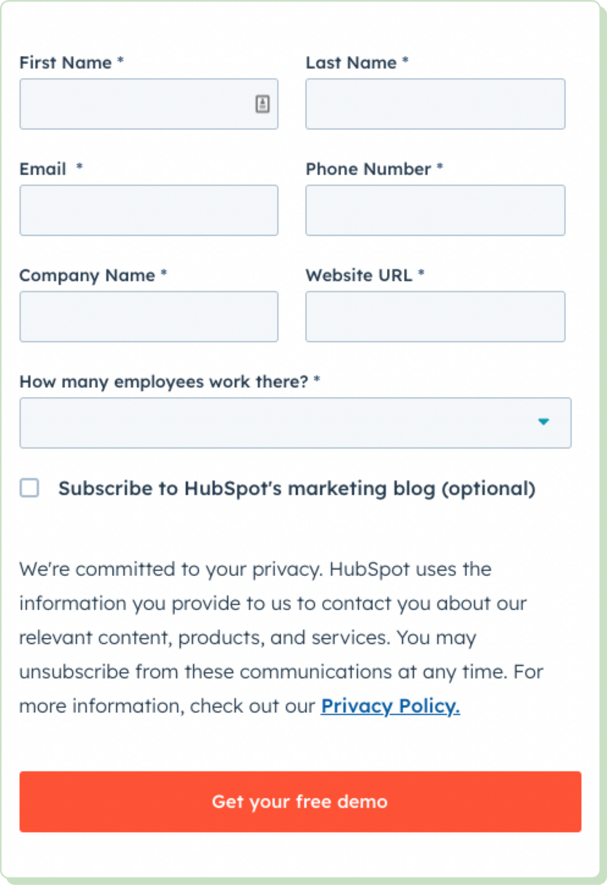
2. HubSpot — Free demo submission
Why it works
Mobile optimization: The form's design is responsive, ensuring
that it is navigable on mobile devices.
Field relevance: Each field is relevant to B2B interactions.
This helps HubSpot tailor its demo and sales approach according
to the provided business context.
Optional subscription: The option to subscribe to the marketing
blog without making it a requirement respects the user’s choice.
It reduces perceived barriers to form submission.
3. Netflix — Subscription
Image source: netflix.com
Why it works
Instant gratification: The suggestion that users can "start
watching" immediately taps into the desire for instant
gratification. This is a powerful motivator in decision-making
processes.
Ease of use: Just one form field allows the user to enter their
email and proceed. This simplicity is crucial for capturing the
fleeting attention of potential customers.
Supporting subtext: "Watch anywhere. Cancel anytime." These two
promises address common user concerns upfront. That is, the
flexibility to view content on multiple devices and the freedom
to discontinue the service without penalties.
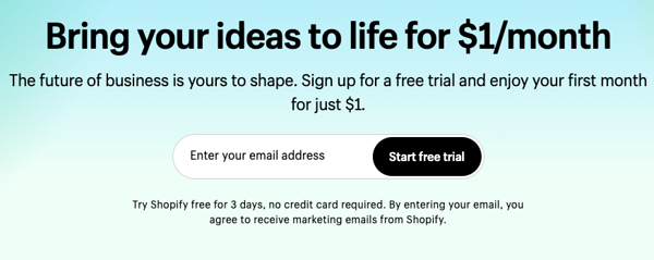
4. Shopify — Free trial
Image source: shopify.com
Why it works
Cost incentive: The introductory offer of enjoying the first
month for $1 is a significant draw. This low-cost entry point is
positioned as a minor investment for potentially substantial
returns. It taps into the user’s economic rationality.
Supportive subheadline: "The future of business is yours to
shape" reinforces the empowerment angle. It appeals to
entrepreneurial aspirations, emphasizing the user’s control over
their business destiny.
Single-field form: The form only requires the user's email
address to get started. This minimizes user effort and
simplifies the conversion pathway. It is crucial in avoiding
form fatigue and reducing bounce rates.
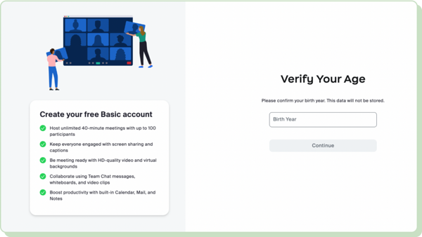
5. Zoom — Sign up
Image source: zoom.us
Why it works
Feature highlighting: By detailing the capabilities, the form
informs users about the key benefits of signing up.
Compliance and security: The age verification step adds a layer
of security. It ensures that services are used appropriately by
the target age group.
Commitment and consistency: The form leverages the psychological
principle of commitment. Once users start filling it out,
they're more likely to complete it.
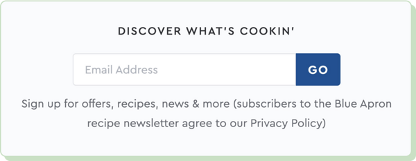
6. Blue Apron — Sign up
Image source: blueapron.com
Why it works
Curiosity and incentive: The headline plays on curiosity to draw
users in. It uses the curiosity gap, where users feel compelled
to find out what they may be missing.
Trust building: Including a note about agreeing to the privacy
policy helps in building trust. It makes the company's
intentions regarding data handling transparent. This is a
crucial factor in user comfort and security.
Direct benefits stated: The subtext "Sign up for offers,
recipes, news, & more" immediately tells users what they
gain by entering their email. This clarity helps them understand
the value of their actions.
7. GoPro — Sign up
Image source: gopro.com
Why it works
Engagement and clarity: The headline is direct and succinct. It
clearly states the benefits of signing up. This approach helps
set clear expectations for what subscribers will receive.
Minimal fields: The form requires only the user's email address,
minimizing barriers to entry. The fewer the fields, the less
effort the user needs to expend.
Aesthetic consistency: The form design follows GoPro’s branding
in terms of colors, fonts, and style. This helps maintain the
web page's aesthetic consistency, which contributes positively
to the user’s experience (UX) and perception of the brand.
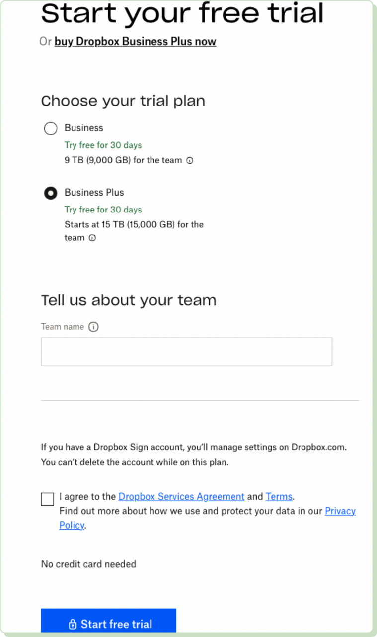
8. Dropbox — Free trial
Image source: dropbox.com
Why it works
No card needed: Clearly stating that no credit card is required
for the trial addresses one of the biggest barriers to entry.
Simple input fields: The form only asks for the "Team name." This
simplifies the sign-up process, making it specifically tailored
to business users.
Plan selection: Users can choose between different plans, each
with clearly stated benefits. This helps them make an informed
decision tailored to their needs.
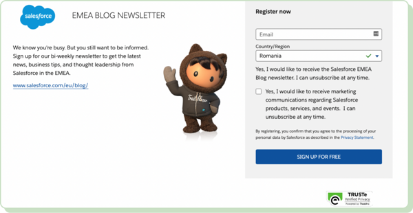
9. Salesforce — Newsletter sign-up
Why it works
Unsubscribe assurance: The form states that the user can
unsubscribe at any time. This mitigates commitment fears and
boosts the likelihood of an initial subscription.
Privacy statement link: Including a direct link to the privacy
statement is crucial for legal compliance. It reinforces
transparency about data handling practices.
User-friendly layout: The form is visually straightforward. It
has well-spaced elements and readable text, which enhance
usability and ensure a smooth UX.
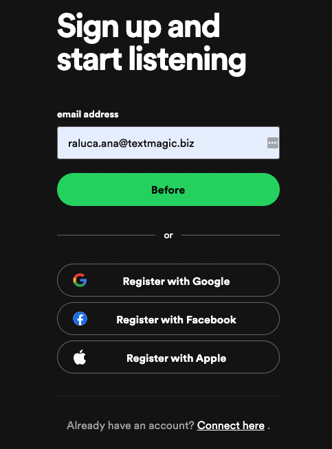
10. Spotify — Sign up
Why it works
Uncluttered layout: The form is visually clean, featuring only
necessary elements. This helps in keeping the user's focus on
the sign-up process without distractions.
Immediate gratification: The direct connection between signing
up and accessing content leverages the psychological principle
of instant gratification. Users are more likely to sign up if
they know they can immediately benefit from doing so.
Quick link for existing users: The option to "Connect here" is strategically placed. It caters to
users who might have navigated to this page by mistake or are
returning users. This reduces potential friction for users who
simply wish to log in.
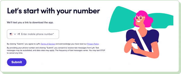
11. Lyft — Sign up to ride
Why it works
International accessibility: The inclusion of a country code
selector accommodates international users. It broadens the app’s
reach and user base.
Opt-out information provided: Instructions for stopping
receiving messages empower users. They provide a clear method
for opting out, enhancing trust and user control.
Prominent submission button: The "Submit" button is prominently
displayed and clearly labeled. It eliminates any confusion about
how to proceed after entering the phone number.
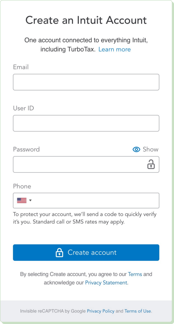
12. TurboTax — Sign up
Why it works
Single account utility: The form promotes the convenience of
having one Intuit Account for all related services. It
simplifies the user's digital footprint by reducing the number
of logins and passwords they need to remember.
Password visibility toggle: The "Show" password option increases
usability. It allows users to check their input and ensure
accuracy without compromising security.
Two-factor authentication prompt: The form underscores its
commitment to security by mentioning that a code will be sent to
the provided phone number. This step is crucial for protecting
sensitive financial data.
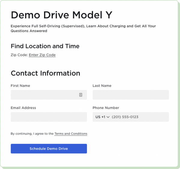
13. Tesla — Demo drive
Why it works
Zip code entry: Starting with a "Find Location and Time" prompt
ensures that the UX is personalized. This step helps Tesla
provide options that are geographically convenient for the user.
Streamlined process: The form is designed to gather all
necessary information in a logical manner. This structured flow
ensures that potential customers can easily understand what is
expected.
Easy access to terms: The terms and conditions are linked
directly from the form. This allows users to review these
documents in full before committing, which is crucial for
informed consent.
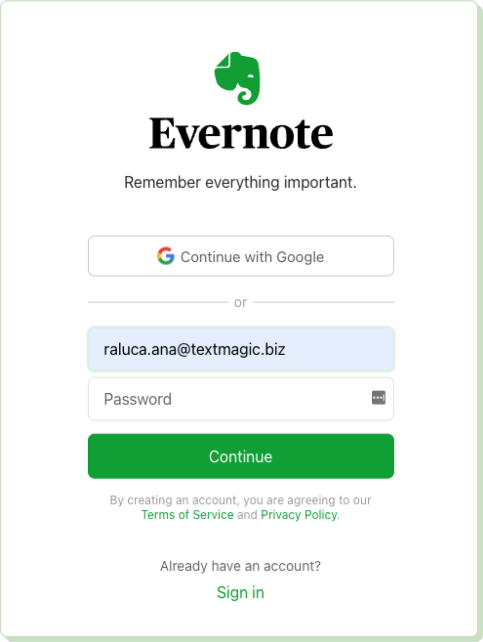
14. Evernote — Sign up
Why it works
Encouraging immediate action: The use of social logins and the
compelling headline play into the psychological desire for
instant gratification and ease. They make the sign-up process
feel effortless and beneficial.
Purposeful statement: The headline immediately communicates the
service's core value proposition. This not only sets the tone
but also aligns with the functional benefits that the service
offers.
Social media integration: The option to "Continue with Google"
provides a one-click registration path, leveraging existing user
credentials. This reduces barriers to entry by eliminating the
need to fill out multiple fields manually.
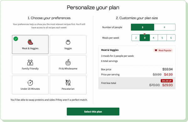
15. HelloFresh — Get an offer
Why it works
Visually appealing: The form uses appealing graphics and icons
related to each meal preference type. This makes it not only
more engaging but also easier to understand.
Clear cost breakdown: Each plan option lists the total box
price, price per serving, and the total for the first box with a
promotional discount. This transparency in pricing helps manage
expectations and builds trust.
Interactive elements: Users can select their preferences and see
the updated pricing and meal options. This helps them make an
informed decision without back-and-forth navigation.
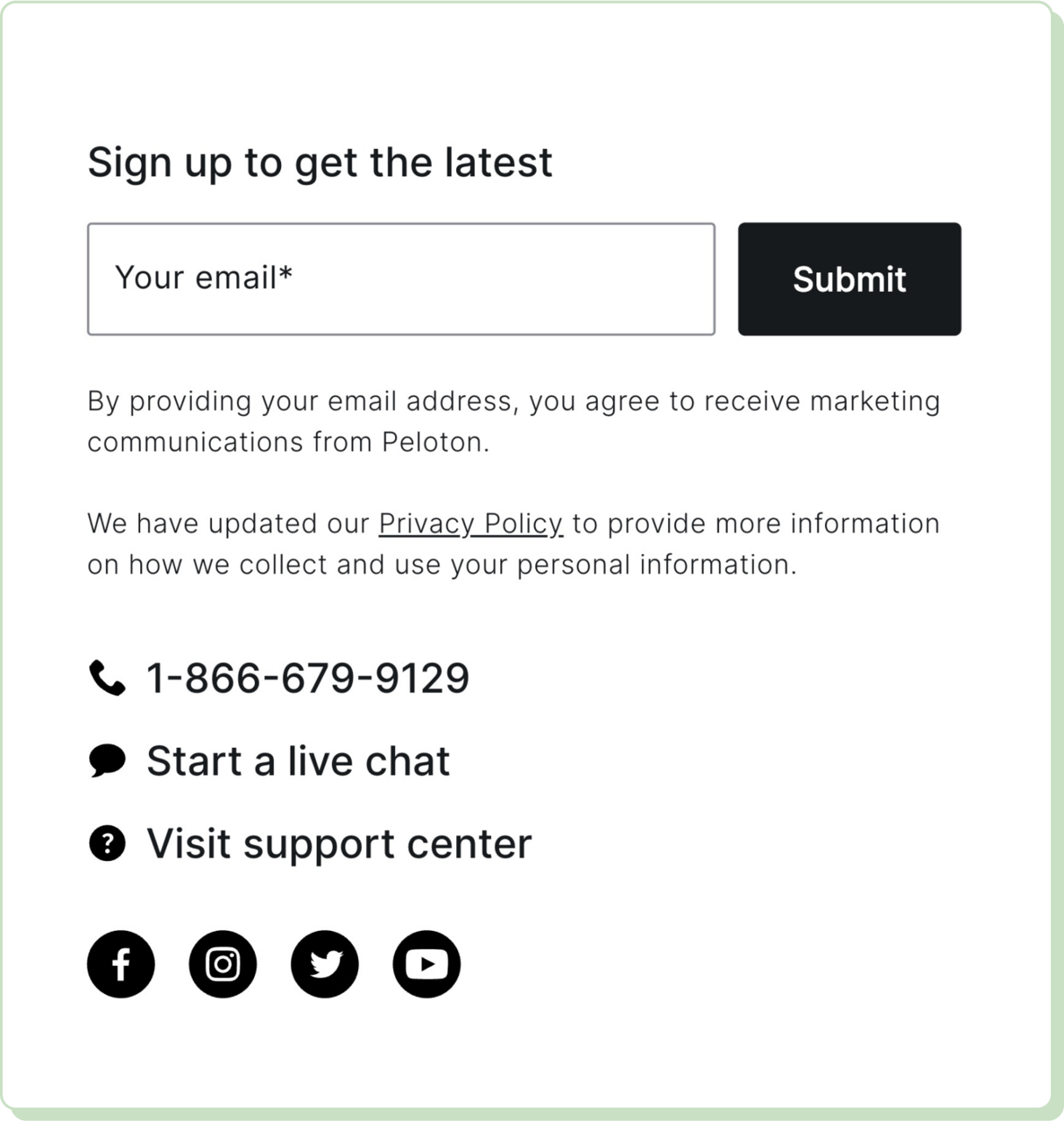
16. Peloton — Email submission
Why it works
Easy navigation: The clearly displayed support options make it
easy for users to seek help without having to search around the
website.
Direct invitation: The headline is straightforward. It
communicates effectively what the user is signing up for. This
messaging helps set the right expectations and reduces ambiguity
about the nature of the emails users will receive.
Informed consent: The form ensures that users are aware of what
they are opting into. This level of transparency is crucial for
building trust. It is also a best practice in adhering to
marketing laws and regulations.
17. Treehouse — Email subscription
Why it works
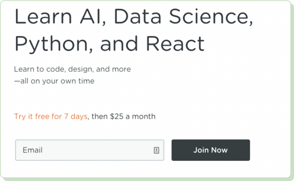
Targeted skill areas: The form mentions trendy and sought-after
skills. This specificity immediately grabs the attention of
prospective students looking for these subjects.
Low-risk introduction: The free trial positions the platform as
user-friendly. It reduces the perceived risk for new users,
allowing them to try the service without any financial
commitment.
Value for money: The form highlights the cost relative to the
potential gains as affordable. This psychologically enhances the
perceived value, justifying the expense.
18. Asos — Subscription
Why it works
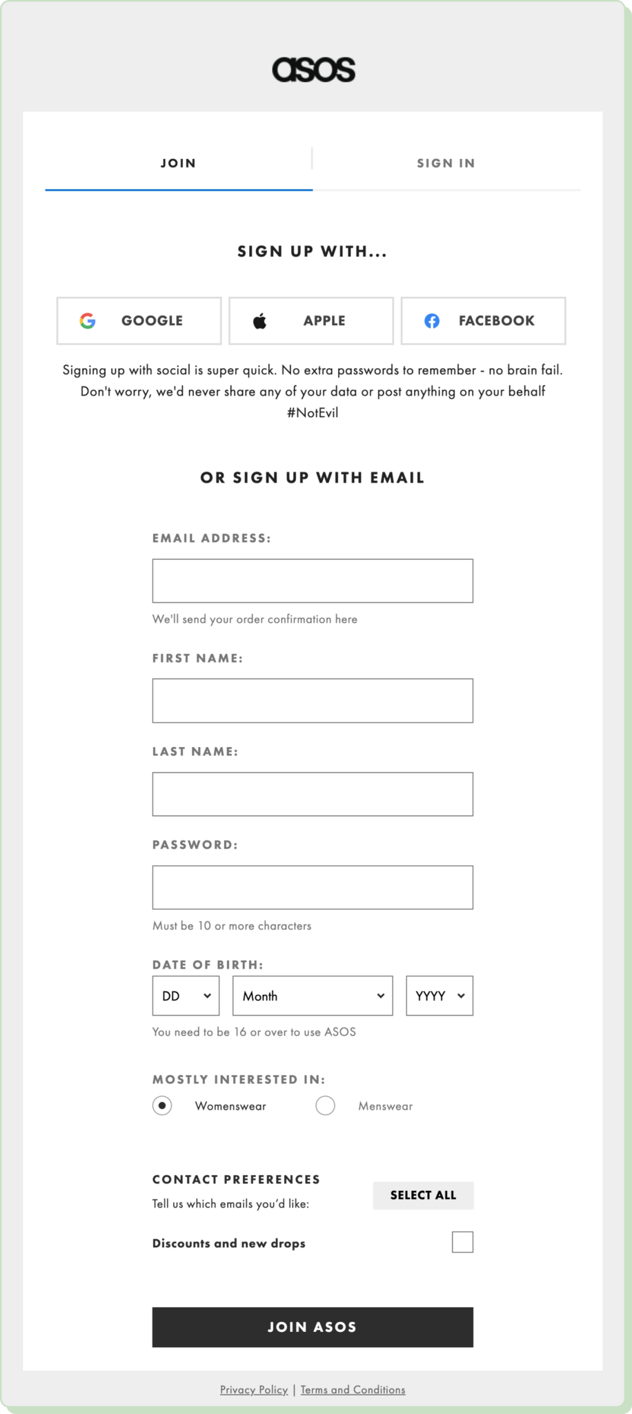
Password security requirements: Requiring the password to be "10
or more characters" enhances security measures. It encourages
users to create stronger passwords.
Structured layout: The form is well-organized. It has social
sign-up options displayed at the top for quick access, followed
by the more detailed email sign-up option.
Gender preference: ASOS can tailor the shopping experience and
marketing emails by asking users about their clothes
preferences. This can enhance user satisfaction and potential
engagement with the platform.
19. Slack — Sign up
Why it works
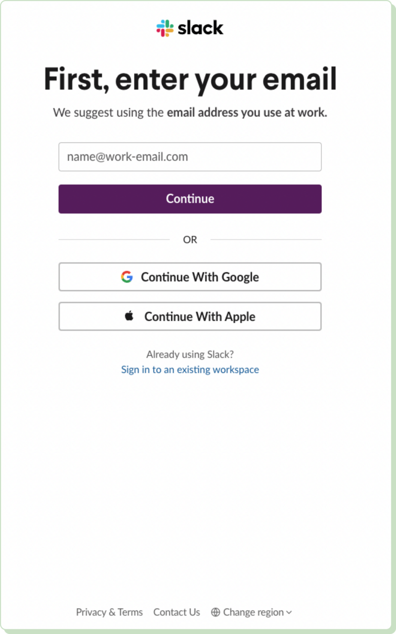
Guided input fields: The suggestion "name@work-email.com" serves
as a subtle guide to help users understand the expected format.
It is meant to reduce errors and user frustration during the
sign-up process.
Regional customization: The "Change region" option caters to
international users, allowing them to adapt their Slack
experience to regional standards and legal requirements. This
customization enhances UX by addressing regional variations in
data handling and functionality.
Existing user accessibility: The option to "Sign in to an
existing workspace" is prominently displayed. This optimizes
user flow and reduces friction. It enables quick navigation for
users who mistakenly arrive on the sign-up page rather than the
login page.
20. Voog — Sign up
Why it works
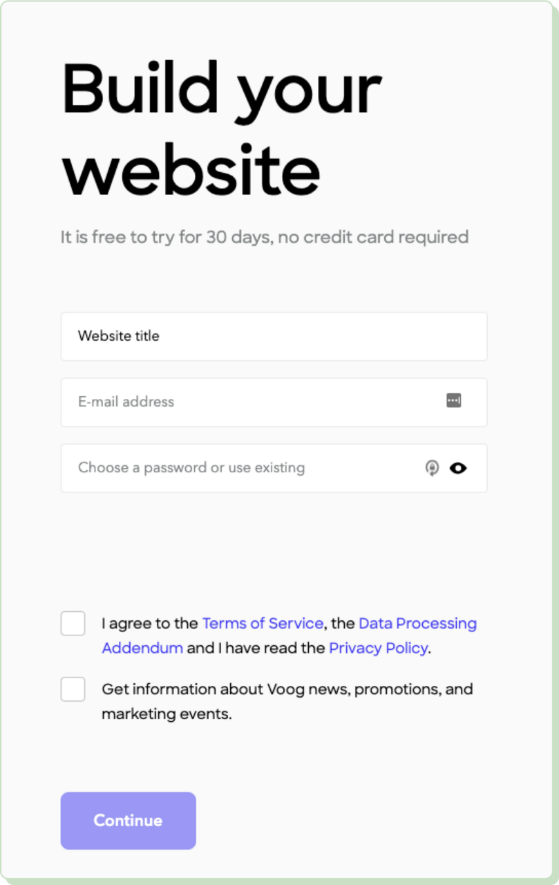
Minimal required information: The form only asks for three
pieces of information: website title, email address, and
password. This approach not only streamlines the registration
process but also minimizes user effort. It is crucial for
maintaining engagement and reducing drop-off rates.
Marketing communications checkbox: The option to receive
information about Voog news allows users to opt-in to additional
communications. This user-controlled approach respects privacy
and preference. It aligns with best practices in email
marketing.
Immediate gratification and value proposition: By offering a
free trial with no credit card required, the form taps into the
psychological preference for trial-based testing. It allows
users to see the value of the service firsthand without any
risk.
How to create a good landing page form
Follow this step-by-step guide to design a compelling landing page form.
1. Define the goal of your form
Start by pinpointing the purpose of your form. What does it have to
achieve? Collect leads, get users to sign up for an event, gather
feedback? The form’s purpose will shape every other aspect of its
design.
Then, consider your target audience. Who will fill out the form? Adjust
its tone, language, and format to match your intended audience’s
expectations.
2. Choose the right type of form
Consider the types of forms discussed earlier in this article. Customize
the form
to ask for relevant information only, depending on your goal.
3. Make the form user-friendly and mobile-responsive
Make sure that the form’s layout and structure are clear and simple and
that the design is minimalistic. Structure your questions in a logical
sequence so that they are easy to follow.
Ensure that your forms are mobile-responsive by designing with mobile in
mind. Test the final result on different screen sizes, and use ample
form fields and large buttons. Real-time validation is very helpful, as
it pinpoints errors and offers immediate solutions.
4. A/B test different form designs
A/B testing is a great and simple way to understand what your audience
prefers. Tools like Optimizely or Visual Website Optimizer help you implement and track changes, leading the way to experimentation.
Try out different layouts, lengths, and field orders. Juggle with different palette schemes, button sizes, and fonts to make forms more
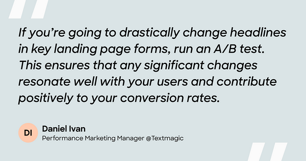
visually appealing. The performance marketing manager at Textmagic
explains the importance of A/B testing form designs:
Implement follow-up surveys to collect feedback directly. Tools like
Google Forms, Survey Monkey, or Typeform help with that.
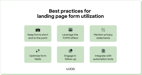
Best practices for landing page form utilization
Follow these strategies for using landing page forms to get more leads:
Keep forms short and to the point
This cannot be overstated — always stick to essential fields only, as
forms with fewer fields have higher conversion rates. Identify the
absolute minimum information required from users to make the follow-up
meaningful.
👍 Pro tip: A name and email address are often sufficient for initial
contact.
Leverage the FOMO effect
The fear of missing out (FOMO) is a powerful motivator. Encourage users to take action through limited-time offers. You can also
highlight a product's or event's popularity.
👍 Pro tip: Phrases like "Limited spots available" or "Offer ends soon"
create urgency and can prompt quicker user actions.
Mention privacy statements
Display privacy statements and include trust signals. This is how you
reassure users about the security and confidentiality of their data.
Make sure your form complies with relevant laws like GDPR. Include a
simple, jargon-free privacy statement that details what happens with the
user’s data.
👍 Pro tip: Use testimonials,
user reviews, and security badges (e.g. SSL certificate, trusted payment processor
logos) to enhance credibility.
Optimize form fields for higher conversion rates
Design form fields to eliminate user frustration and avoid unnecessary
complexity. Where appropriate, utilize browser autofill capabilities.
Use appropriate field types, such as dropdowns, checkboxes, or date
pickers, to simplify the input process.
👍 Pro tip: Provide real-time input validation and indicate mandatory
fields.
Engage in follow-up
Ensure immediate confirmation by sending an
automated email response. Confirm the receipt of the submission and what the next steps will
involve.
👍 Pro tip: Nurture leads using drip email campaigns to keep users
engaged. Provide valuable content that aligns with their interests.
Integrate forms with marketing automation tools
To streamline data flow and utilization, connect your forms to tools
like HubSpot, Marketo, or Mailchimp. These tools can automate tasks like
email notifications, lead scoring, and follow-up campaigns.
👍Pro tip : Ensure that each form submission is fed into your customer
relationship management (CRM) system. You may utilize Salesforce or Zoho
CRM to do so. This enables sales or service teams to act promptly based
on the captured data.
Future trends in landing page forms
Here are some predictions on how landing page forms will evolve with
technology.
🔮 Artificial intelligence (AI)-powered tools are likely to perform
real-time analysis of user dynamics on a specific page. Let’s say
someone repeatedly accesses your blog and is interested in specific
article topics. The AI algorithm will adapt forms to include questions
related to those topics.
🔮 Voice search forms will become the norm as demand for accessibility
increases. With more users on the go, typing is likely to become
obsolete.
🔮 Predictive input will drastically reduce user effort by analyzing
heaps of user data to generate auto-suggested texts. It’s likely to
become so performant that you’ll only have to type a few characters to
get it going.
Personalization and dynamic forms will also play an important role in
improving user engagement.
💫 Dynamic forms that adjust based on data about a user’s engagement
level or demographic information can provide a more personalized
experience. For example, returning visitors could see a simplified form
based on previous interactions.
💫 Forms will become smarter and more context-aware. They will adapt not
just to the data entered but also to the user's context providing a
tailored experience. Such instances include the time of day, location,
or device used.
Next, create a landing page with Voog
Voog helps all users — even inexperienced ones — create websites with
embedded forms.
You can personalize forms so that they fit in with the branding
elements of your landing page.
Forms are fully responsive on any screen size and type, allowing
for real-time data collection and organization.
You can easily integrate forms into any landing page using the
drag-and-drop feature — no coding skills necessary.
This way, any business owner can
build highly interactive landing pages with integrated forms. Make sure
yours is the next to stand out.


