Images can make or break the performance of a website. Recent data shows that for every one-second delay in page loading, website conversion rates decrease by an average of 7%. To perfectly balance visual quality and web efficiency, image optimization is essential.
It also needs to be done right. Poorly optimized images are a major factor in slowing down website speed, as tools like Google PageSpeed Insights demonstrate.
Read on to learn more about the techniques to optimize your website's images and keep visitors engaged.
What is image optimization?
Generally, image optimization is about making images as small as possible without losing quality. In the context of web development, it is also about ensuring that they are accessible and easy to read on all devices.
This is where image resolution and dimensions come in. While high-resolution images provide better quality and detail, they can slow down loading times and increase data use. Optimizing images by adjusting their size and using responsive techniques can balance quality with performance.
Why consider image optimization for web?
Here are the key benefits of image optimization for web.
Google’s mobile-first indexing places more importance than ever on mobile site performance. Optimized images contribute to a better mobile experience, which Google interprets as an indicator of a quality website.
How to optimize images for web in nine steps
Follow these steps to effectively optimize images for the web.
1. Choose the right format
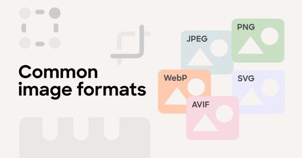
Choosing the right image format ensures that your visuals load fast and look good on all devices and browsers. These are the most common image formats:
Before deciding on the final format, you will need to analyze the content of your image and its intended usage.
👉 If we’re talking about a background image where details can go unnoticed,
JPEG is your choice. For user interface (UI) elements like buttons or icons, PNG or SVG are better matches.
👉 Make sure to check browser compatibility and website requirements. WebP has many advantages, but you will have to check whether your audience's browsers support it.
👉 If your focus is on dynamic websites or applications, consider AVIF or multiple image formats. Your choice will depend on your users’ browser capability to maintain both performance and compatibility without compromising on either.
2. Adjust image dimensions
There are two techniques that you can use to adjust image dimensions without losing quality — resizing and cropping.
Resizing
Resizing large images to the correct dimensions ensures that they look good without being unnecessarily large in file size.
Image resizing tools include professional software like Adobe Photoshop or free online tools like Pixlr, GIMP, and Canva. The key option you want in a resizing tool is reducing the dimensions without making the image blurry or pixelated. This is also known as 'resampling' the image.
👍 Pro tips:
Cropping
Cropping places the focus on the most important part of an image, taking out unnecessary elements. This boosts the visual impact of the image and reduces file size in the process.
It’s crucial to maintain the aspect ratio (proportional relationship between an image’s width and height) while cropping. Most editing tools have a lock aspect ratio feature, helping you keep images balanced. Almost all photo editing tools allow you to manually select the cropping area or use pre-set aspect ratios.
👍 Pro tip: Use the rule of thirds to achieve optimal balance. Split an image into nine equal parts by drawing two horizontal and two vertical lines that are evenly spaced. The points where these lines intersect are the best spots to place the main parts of your composition.
We asked our designer for his opinion on the importance of dimension
adjustment techniques. This is what he mentioned:
3. Compress your images
Another way to make your site faster is to compress images for the web. You will need to choose between lossy and lossless compression.
Lossy compression
This compression type shrinks file size by permanently deleting data that doesn't significantly affect the image's visual quality. For instance, you can remove minor color details in areas of subtle color gradients. If done well, the changes are hardly noticeable.
Lossless compression
Lossless compression reduces the image file size without reducing quality. The compression process results in 0 data loss, allowing you to completely restore the file to its original state. This compression method reorganizes and optimizes data, especially when it involves repetitive information.
After choosing the compression technique, familiarize yourself with the tool.
👉 When using the preview feature, you can compare the compressed image against the original. This helps you find the right balance between file size and image quality.
👉 Find a tool that offers batch processing when working with multiple images. Compressing several images in one go will save you tons of time.
👉 Try different formats (like converting a PNG to a WebP) for better results. Test and see which gives the best size-quality balance for each image.
4. Optimize image color depth
Color depth is the number of bits used to represent the color of a pixel in an image. It determines the total number and range of colors that can be displayed. The fewer colors displayed, the smaller the image.
The trick is to reduce color depth without affecting overall visual quality. This works with basic graphics, icons, or images where a full range of colors is optional.
However, when it comes to photographs, reducing color depth leads to banding or posterization. It can also replace smooth gradients with distinct color bands.
Here are some tools that can adjust color depth without significantly
affecting visual quality.
5. Use responsive images
Responsive images adapt to the size of your viewing device.
Let’s use a smartphone as an example. It's not efficient for the phone to load large images meant for desktops, as that uses too much data and makes the page load slowly. If your website has responsive images, it will show the viewer a smaller version of the desktop-size image.
The idea is to create images that fit each device well. The “srcset” attribute in HTML5 allows you to specify multiple image files for different screen resolutions and pixel densities. The browser automatically selects the most appropriate version based on the current viewing device:
<img src="small.jpg" srcset="medium.jpg 1000w, large.jpg 2000w" alt="example image">
In the above example, devices will load small.jpg by default. However, screens that are 1000 or 2000 pixels wide will load medium.jpg or large.jpg, respectively.
The <picture> element works with <source> elements and a final <img> element as a fallback. It provides more flexibility than srcset, as it allows you to apply media queries:
<picture>
<source media="(min-width: 1500px)" srcset="large.jpg">
<source media="(min-width: 1000px)" srcset="medium.jpg">
<img src="small.jpg" alt="example image">
</picture>
Here, screens wider than 1500px will display large.jpg. Screens wider than 1000px will display medium.jpg, and smaller screens will display small.jpg.
Before starting with responsive images, find out which device your audience prefers. You can check that in your website’s analytics section.
Then, adjust your images to fit the most common screen resolutions. Voog helps you be on the safe side by allowing you to create three distinct image sizes:
Check how different devices display them to see whether they are loading correctly and are visually appealing. Maintain image quality without overlooking file size. Find that sweet spot where images are qualitative but don't have a negative impact on page performance.
6. Test image performance
Start with analyzing performance metrics. Track the following ones in addition to page load time.
You can also utilize advanced tools for evaluating image performance on your website.
Google PageSpeed Insights provides data on how fast your site
loads. It also offers recommendations for improvement, including
image optimization.
Image sources: imagify.io (before) / ryrob.com (after)
GTmetrix analyzes your web page speed and provides actionable recommendations. It especially highlights issues related to images.
WebPageTest offers a detailed analysis of load times, including how long each image takes to load.
The point here is to compare website performance metrics before and after optimization to clearly understand its impact.
👉 After the optimization is successful, use the same tools to re-test your website. Compare the new metrics against the old ones.
👉 Go over technical metrics, but visually inspect your site too. This will ensure that image quality remains high post-optimization.
7. Use proper naming conventions
Using the right naming conventions ensures that your images are search-engine friendly.
Alt tags
Alt tags are crucial for image search engine optimization (SEO). Search engines can’t really "see" pictures, so they act as an interpreter that describes your visuals. Insert relevant keywords into your alt tags to explain what images show and boost your website's search ranking.
👍 Pro tip: Include keywords naturally where appropriate. For example, alt="Red delicious apple variety."
Captions
Captions are not as important as alt tags when it comes to search engines. However, search engines still crawl them, which can impact your SEO practices. Use captions to provide more context for images or to explain what the user is looking at in case extra info is necessary.
👍 Pro tip: Keep your captions to the point, yet sufficiently informative.
Descriptions
Longer descriptions can also impact your SEO strategies, as they provide extra background about a particular image. If your web page format allows image descriptions, don’t leave any blank spaces.
👍 Pro tip: Provide additional details for each image when you’re describing a product. This is an excellent space for natural keyword insertion.
8. Implement lazy loading
Lazy loading reduces the initial load time of a webpage. It can significantly improve website performance by delaying the loading of non-critical content. This works like a charm for sites with a lot of images, such as galleries, eCommerce sites, and blogs.
It also minimizes the number of HTTP requests and reduces bandwidth usage on initial page load. This is a must when you have a high-traffic site.
Implementing lazy loading on your website is pretty easy. You can use various plugins and libraries to facilitate its integration:
9. Leverage content delivery networks (CDNs)
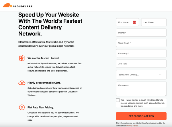
CDNs can significantly speed up image delivery by storing cached versions of images on servers around the world. CDNs like Cloudflare also offer automatic image optimization features, resizing and compressing images based on the end user’s device and browser.
Image source: cloudflare.com
Best practices for maintaining image quality
By this point, you likely have a deeper understanding of how to optimize images for web. But how do you maintain image quality post-optimization? Following these practices will help.
Keep web images up-to-date
Ensure accessibility
We reached out to the UX designer at Textmagic and asked him to tell us
how to achieve the highest level of accessibility. This is his response:
Advanced image optimization tools
We’ve already mentioned several tools that you can use to optimize your images for web. The following tools will elevate your image optimization efforts to excellence.
Plugins for content management systems (CMSs)
1. WordPress
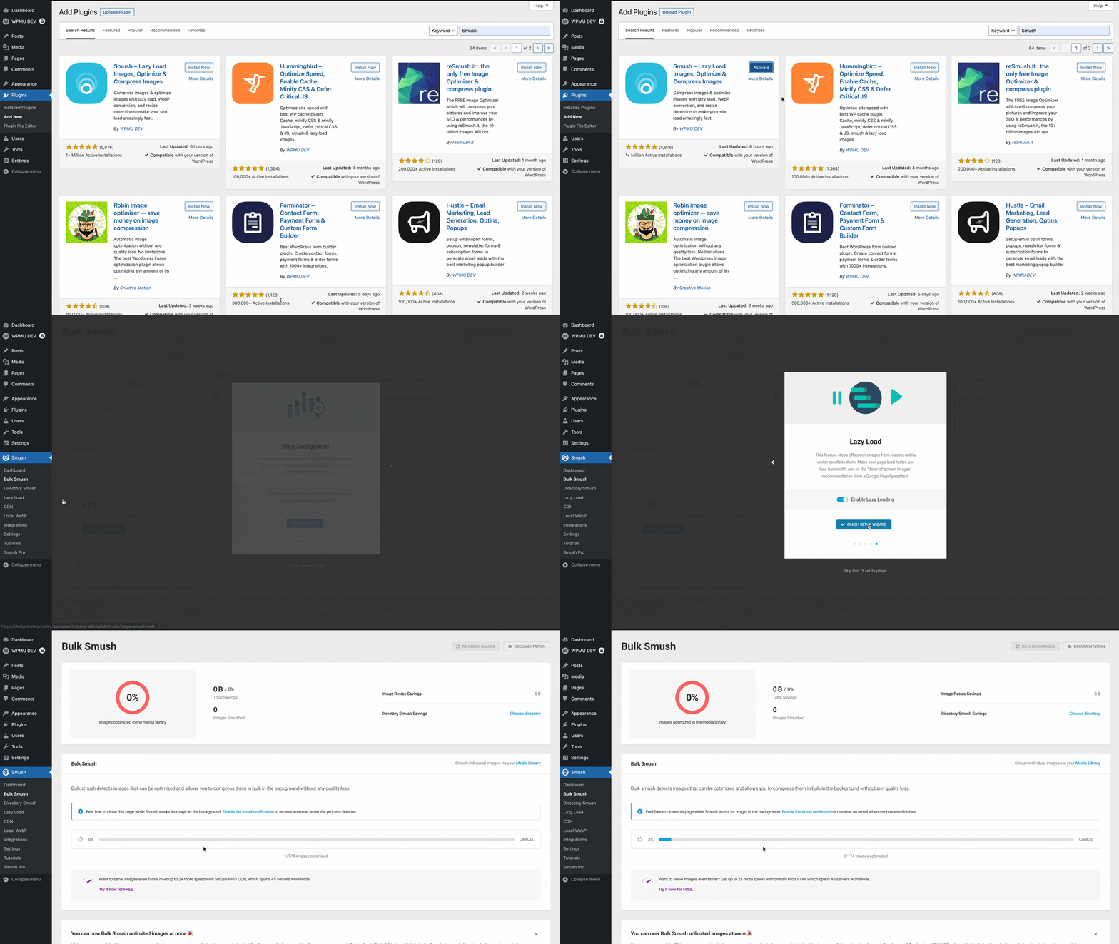
Smush offers automated image compression, resizing, and an option to optimize already uploaded images.
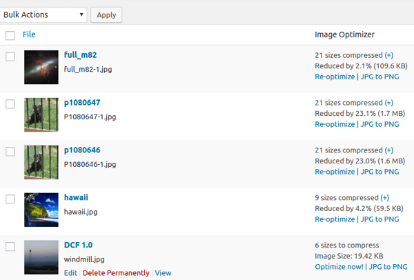
EWWW Image Optimizer automatically optimizes images uploaded to WordPress. It can also optimize images in bulk from the WordPress library.
Image source: wordpress.org
2. Shopify
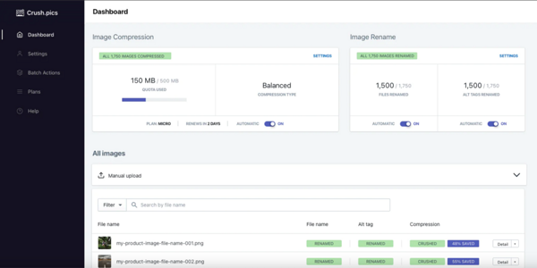
Crush.pics automatically compresses and optimizes product images and assets.
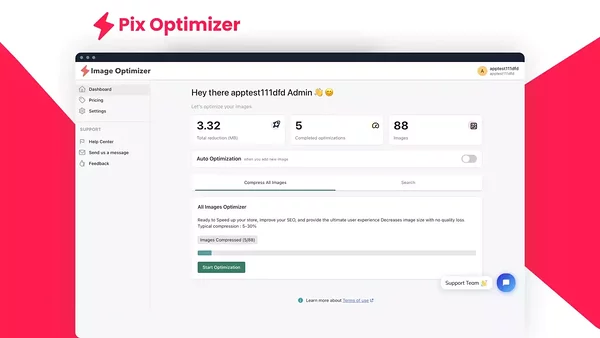
Pix Optimizer employs advanced optimization and lossy compression techniques to minimize file sizes while maintaining desired quality.
AI-powered tools
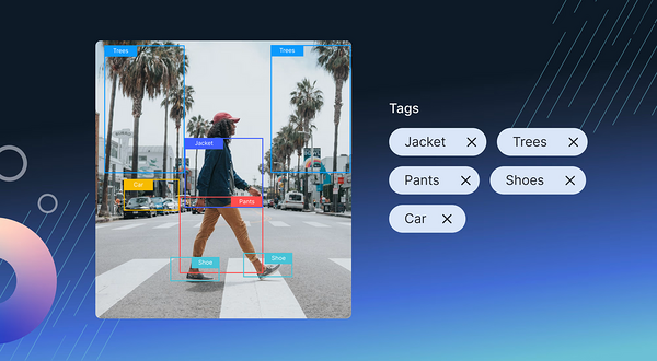
Cloudinary uses artificial intelligence (AI) to automatically tag and intelligently crop images for faster loading.
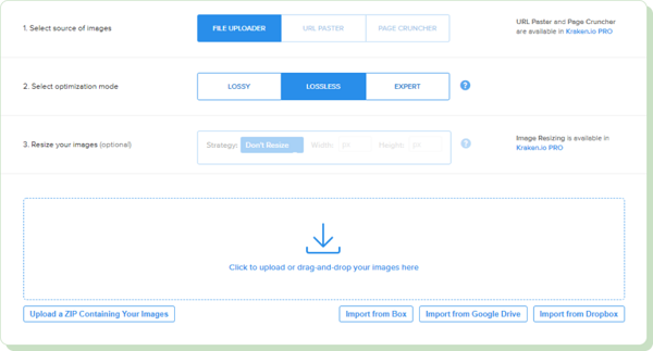
Kraken.io incorporates powerful AI compression algorithms. It also boasts automatic image resizing for various devices.
Image source: pressidium.com
Start optimizing images on your website today
Optimizing your website images can make your website more appealing to both users and search engines.
Use the image optimization tips from this article and enjoy the benefits that come with higher user engagement, better search engine rankings, and increased website traffic.

_block.png)
_block.png)
_block.png)
