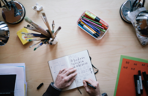
You don't need to hire a designer for every design task — just like you don't have to call your copywriter when writing everyday emails.
Understanding design and being able to apply it at the basic level doesn't require you to have talent or have formal design education. It's a lot easier than learning French and it pays off handsomely — just like being able to read and write. This is rather important to remember — don't be afraid, design is not for designers only.
Design isn't art. Great design makes products usable, bad design makes them useless. Designer is an engineer connecting products with their users.
In web, design helps the visitors to use, read and understand the content of your website. A website with great design takes the effort away from the visitor. It's easy to navigate, find info, reach answers and become your customer.
I'm going to give you a few simple rules that help you apply basic design in your work with content. These rules also help you be a better partner for designers when hiring them for a design job.
Layout
Simple layout. Humans are pretty bad computers. Don't try to make them think, instead adapt your design to their simple, linear abilities. Simple, geometrical and consistent — that's what a layout should be. Use as few differently designed elements at a time (at once on screen) as you can. Keep the navigation consistent across the site. Use grid-based layout to present content in a neat and harmonious way.
Readability. It's difficult to read long lines of text. That's why all newspapers give you multiple short columns instead of one wide. In web, columns aren't so nicely implemented technically and are a bit counterintuitive — we are happy to keep scrolling a single column. But the lines of text in this column should still be optimally just 60 characters wide. A bit more is a good compromise — as we can't have multiple columns in web. This blog is for example 80 chars wide. Another important factor of readability is character size. It should be bigger than you think. It's now basically accepted that a standard body text in web should be 16px — more than what you are reading right now.
Whitespace. Rookie designers try to fill up every corner of the canvas with some information. Such cluttering is both very hard to "read" and looks unmistakenly cheap. Embrace emptiness. Empty space — whitespace — gives the content it surrounds a lot of value, a lot of attention.
Responsiveness. Until recently, websites were designed for a single usecase — for viweing them on desktop/laptop screens. Since then, most of us have adopted smartphones and are browsing the web from a variety of tiny screens. Moreover, instead of mouses clicking, clumsy fingers are tapping the links and buttons. Therefore designs must be flexible and fitting — responsive — on all kinds of devices.
Content
Writing. Copy is the most undervalued part of design. Design is about usability, understanding. The easiest way to spread understanding is through explaining it with precise, short and sufficient words. True — every customer has specific needs and they use different sentencing when searching the web and might not find you if your site doesn't include those wordings. So you should cover a variety of different words to attract those searches. The solution is to keep the main pages short, simple, precise flavored with your branding and style. But the blog and some lower level pages should be abundant with words attracting the long tail of searches and interests to your website.
Short paragraphs. People don't read websites. They scan, trying to find relevance or interest quickly. They tend to read headlines rather than body texts and quotes rather than paragraphs. Structured texts are therefore more likely serving their purpose to get read — or scanned through. Break long texts down to shorter subsections. It also looks nicer, more worked through to the human mind.
Pictures. Videos. A picture is worth a thousand words. Video — ten thousand! Illustrate long texts with visuals. Use pictograms (icons) beside headings to speed up communication and improve understanding. Good enough pictures are easy to make if you just learn a few photography basics too.
Aesthetics
Minimalism. Most of what I said above was about being as simple as possible. It's both about making the design task solvable and reaching a nice contemporary result. Simplicity isn't dull. Human mind associates order and simplicity with beauty. Minimalist scandinavian design is beautiful. Don't experiment unless you get paid for finding your own unique style as a designer.
Colors. Some colors match, some don't. You don't have to guess, it's pure mathematics unless you are a superstar designer who can basically match anything (because he can). Just go and pick colors yourself for your website theme.
Typography. You don't have to stick to 5 fonts of the olden times in web anymore. There are hundreds of free and not so free webfonts. But don't 'get crazy'. Unless you know you are good enough in typography, stick to the Arial-like sans fonts or Times-resembling serif fonts. Comic sans and other 'funny' fonts should be left to professional use :) Oh, and be sure that the font you choose supports the languages you intend to use on your site. Not every font has cyrillic or even East European characters included.
Be honest. Avoid cheese. Being honest is priceless. Instead on illustrating the team section on the website with a stock photo of smiling people of every gender and nationality, use pics of your own team. Never use stock images of shaking hands and suits of cheesy businesspeople. Show your real customers, real workplace, real products.


