At Voog we group our
templates into three categories:
store,
blog and
webpage templates. Although all of them have all the functionalities necessary for every case, the visual differences make them perfect to use within the specified category. If you're wondering which one of those you could and should use for your website — we’ll try to answer in the following article.
Webstore
The very first product sold in the World Wide Web was Sting’s album
“Ten Summoner’s Tales" in 1994. Today, e-commerce is bigger than ever and growing hourly. Sites like
Amazon,
Ebay,
AliExpress and
Walmart made online shopping quickly popular and today there are more than
650 000 online stores. As the world continuously moves to the Internet, having a functioning online store is an absolute necessity. Different shipping possibilities make e-commerce easier with every passing day, so it's fair to say that online stores rule the waves.
The album "Ten Summoner's Tales" from Sting was the first product bought from the internet in 1994.
Voog has a safe webstore-functionality, which allows you add both shipping and payment methods, manage your invoices and deal with incoming orders quickly and professionally. You can also add variations to your products, which make selling similar products easy and simple. The best Voog templates for building webstores are
Anchorage,
Sapporo,
Santiago and
Longyearbyen. All four have a beautiful landing page, big wide backgrounds for images and product and product list layouts. The latter allow you to create
product pages, looking much like visual display stands, making it pleasant and enyoyable to browse your wares.
Seperating pages to products and product lists allows you to categorize your products and makes it easier for your customers to browse them.
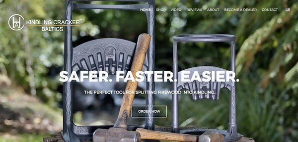
Let’s take a look at kindlingcracker.ee, made with the Anchorage template. Right on the front page, a beautiful image of the product emerges, together with a slogan. The page also has a clearly visible logo and a call-to-action button. The rest of the page has a lot of space between the content areas and is decorated with many vivid images. Last, but not the least, the customer has many options to add products to the shopping cart, making it easy to convince visitors to buy the product.
kindlingcracker is a perfect example of a well made webpage. On the front page is a big image of the product, logo, slogan, call-to-action button and the menu. The customers understand instantly what is being sold and how they would get one for themselves.
Let us take a peek here —
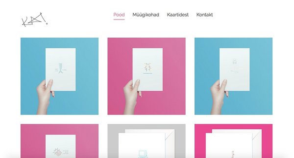
kaihinnosaar.com, built with the Santiago template. Again we see really simple and repeating patterns and colors which keep the page clean and make it easier for customers to concentrate on the page’s content, rather than the page itself. On this webpage, as little as possible is represented in words. This should be the main idea here: play your strenghts where you have them. If the charm of your selling article lies inside of it, or in the idea or quality of the product — allow the customers to read about it. Then again — if the beauty stands in its visuals, let them see!
kaihinnosaar.com is a stylish, light and beautiful webstore, which represents its value with all the company has to offer. The Santiago template is perfect for achieving easiness, which makes browsing pleasant and calls to look for more. Blog
Same as with webstores, blogs got their big start in the 90s.
Wordpress and
Blogspot made blogging easy for everyone and so has it stood since. Nowadays, blogs are way more than just blocks of text from someone’s day-to-day life — hundreds of thousands of companies post news about product development daily, making the information more accessible than ever before. This rich flow of information is vital to remain competitive. Hell, even I watch movies with 3,5+ stars over those that I have heard nothing about.
Blogs give you an opportunity to reach even further. Invite the readers you have similar interests with, share your experiences with them and why not earn some money while you do it? Voog has templates made especially for managing blogs:
Paris,
Barcelona,
Sapporo and
Amsterdam.
Here we have a beautiful blog made with the Paris template —
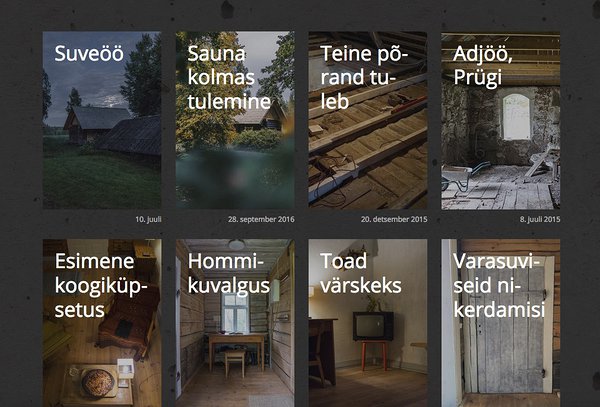
meelva.voog.com. The site is enchanting — its stories practically tell themselves and you can easily read more if you so desire. This is the way most of the world’s blogs work — it uses numerous images to evoke an emotion in which the blogger can then use to tell their story.
Web-blog meelva.voog.com is magical and tells you a story without even seeking for it, while at the same time calls visitors to look for additional content. For this blog, our Paris design is used.
In conclusion
We see new websites pop up constantly, growing ever more beautiful and fascinating. Thought-out content, beautiful images and clean design make web-browsing a true luxury and we’re happy to see that more and more of those websites are created with Voog. Perhaps your own website is built with our platform? Or maybe you are eager to start building it now? In any case, we are more than happy to see you again and we hope that your website will be awesome!


